

Destination Wedding Inspiration: Pantone’s Colour of the Year for 2022
For the first time ever, Pantone has created a brand-new shade for its annual Colour of the Year: Very Peri. The periwinkle hue has shades of blue and violet and is a gorgeous choice for any destination wedding. The newness of the shade is designed to encourage joy, creativity and imagination. To help you get inspired for your big day in paradise, we rounded up some of our favourite ways to incorporate this dreamy colour into your wedding.
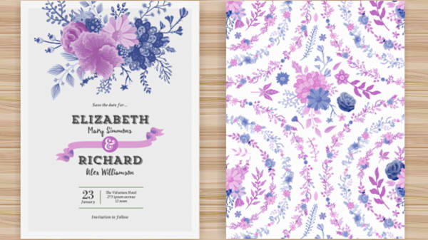
The invitations
Your invitations and wedding stationery are one of the first impressions your guests will have of your wedding day. They’re a great way to incorporate your colour scheme and aesthetic from the moment they open the envelope to your save-the-dates. You can design your stationery online for free and incorporate the Very Peri colour or have them professionally designed.
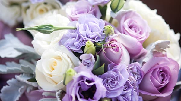
The florals
Pops of Very Peri will brighten any floral arrangement and are a great way to incorporate the trendy shade into both your ceremony and reception décor. Periwinkle, dried lavender and chrysanthemum all come in hues of Very Peri so you can mix and match for your bouquets and arrangements. Go for a monochrome look or add pops of colour to a neutral bouquet of creams, whites and lush greenery.

The attire
You might not want to walk down the aisle in a Very Peri wedding dress, but you can incorporate the colour into your wedding day attire in other ways. Incorporate the shade with a pop of colour in the grooms’ and groomsmen’s ties, the bridal shoes and the bridesmaid’s shoes. Very Peri also looks great as bridesmaids’ dresses, although we recommend keeping the dress style simple to ensure the vibrant shade doesn’t overpower the overall look.
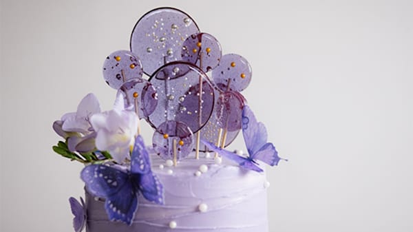
The cake
What could be more delicious than a Very Peri cake? Your wedding cake is a great way to have fun with your colour scheme, and you can go as bold or as simple as you want. Choose a cake that’s completely decorated in the Very Peri shade or opt for a plain white cake with Pantone accents such as edible flowers and decorative piping.
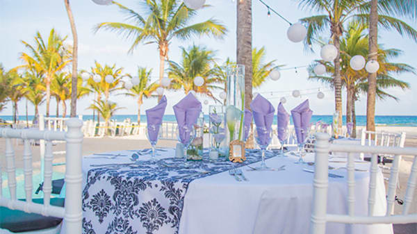
The table settings
Very Peri is a bold colour, so when incorporating it into your table décor, we recommend using it as an accent colour rather than the base. White and cream linens look beautiful when paired with Very Peri-hued napkins, wine glasses and chargers. You can also add a coloured silk bow or sash to the back of your chair covers to tie the entire look together.

You may also like
Topic